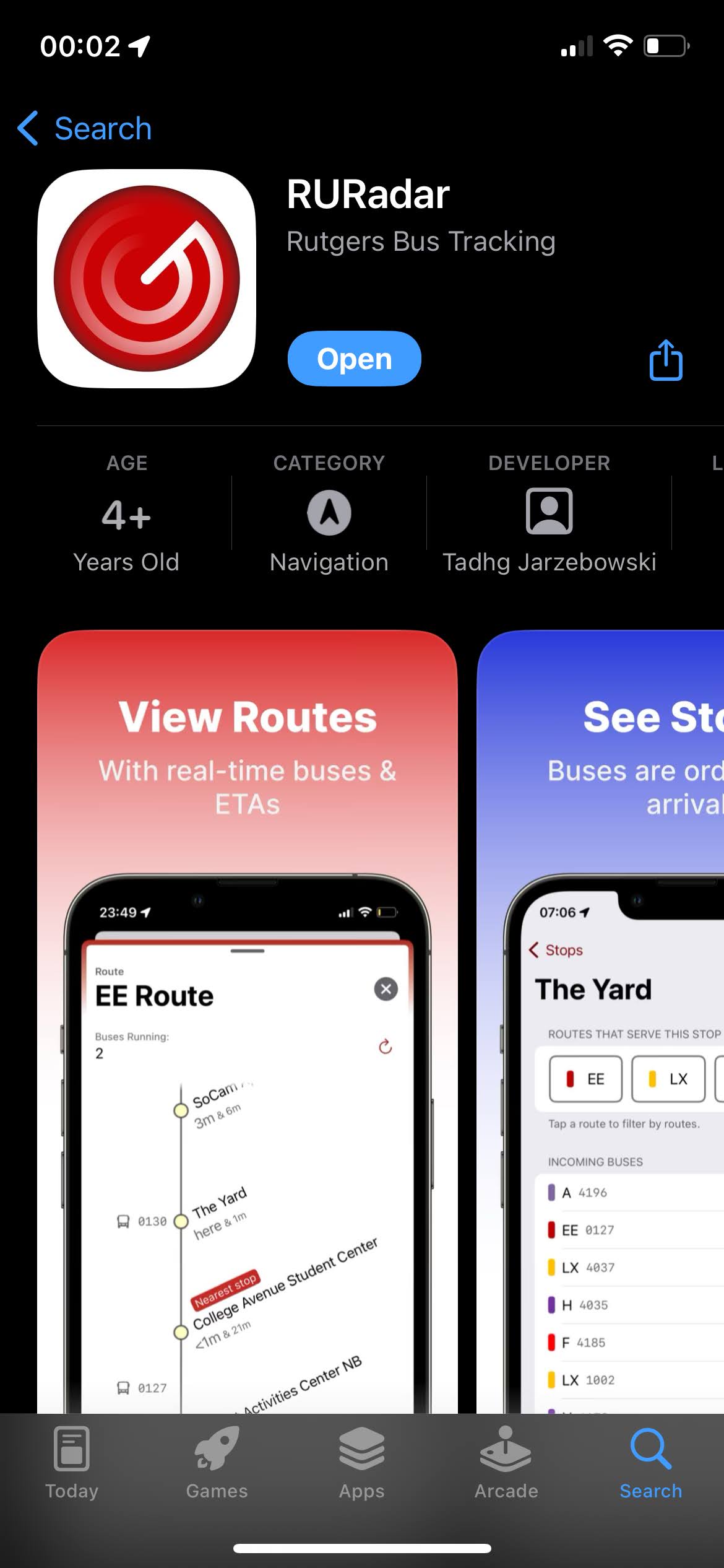
RURadar
RURadar is an iOS application designed to tap into PassioGo’s API to view real-time information about the Rutgers University bus system.
The app was designed in response to the existing PassioGo app; All I’m going to say is that PassioGo is a hodgepodge of everything I don’t like about cross-platform apps.
RURadar was the result of experimentation in Xcode and Swift. I had never worked with either before, and learning how use them was a fun challenge. The app followed Apple’s stylings, and used loads of native iOS components, because I knew that users prefer apps that feel like they belong on their device. It’s a side project that grew into a monster, and I’m proud of it.
Let it be known that everything stated here is past-tense, and may not reflect the current nature of RURadar. I am simply recounting my work on this project.
Timeline / Story
I had been interested in tracking Rutgers’s buses. Call it my love for “monitoring the situation”. It’s cool to look at these dashboards; it feels like you’re a commanding military officer looking at all his troops moving about. I don’t control the buses, but I know where they’ll go, so it’s close enough.
Web
The first prototype of some form of visual bus tracker application was this web app, which mimicked a radar screen scanning for stuff, like in submarines, and the movies. I did this in freshman year, and when I got it working, I put it on the TV in my dorm room and looked at it, arms crossed, and really proud for like 15 minutes. Anyone walking down the hall was promptly notified of my achievement, and I invited them in to take a look. Cool as it was, it was only marginally useful for actually tracking the buses on my phone. The buses had small labels, you couldn’t filter, it didn’t show their routes, and it didn’t show stops or ETAs. Just like a radar, you only knew the current location.
I’m really proud of the way the sweeping “bar” lights up the buses. It pulls the bus location every couple seconds, and it takes the same time for the bar to sweep around. It’s not a “real” radar, but it feels like it. The dots fade out the longer it’s been since the bar hit it, so you instinctively know that the information becomes outdated, and it’s fresh when it’s just been lit up. I used Leaflet.js for this, a library I was familiar with from two previous projects.
The “Radar” moniker is very visually obvious in this website.
iOS
Coming back to school sophomore year, Rutgers had switched who they paid to track the buses, and unfortunately for me, that meant that my previous “RURadar” API (and by extension, project) was no longer functional. However, it didn’t take long to swap out the API endpoint, and update the javascript to fetch the lat/lon of the buses in the new format. Easy stuff.
However, along with changing which company tracked the buses, what also changed is what app we needed to use (as students) to view the buses and routes. We switched from using Transloc to Passio Go to look at buses. Passio Tech is the company, Passio Go is the bus viewer.
Complaining
Passio Go’s interface, in my opinion, was, and still is, just hideous. It was clear to me that they were butting up against about 4 moving factors which made the experience just awful. First, the app’s UI controls reflected that it was developed for a cross platform system. That in itself isn’t necessarily a death blow, but this just felt so out of place on the iPhone. There was this hamburger menu on the top left, something Google introduced for Android with Material UI.
Google then sort-of killed their famous hamburger menu (that usually came with a “swipe from the left edge to reveal it” gesture to accompany it) when they added a system-level swipe-to-go-back-now-presses-the-back-button gesture in an attempt to modernize their ui buttons, but unfortunately, so many Android apps expect a back button, so it’s frankly impossible to remove it. The legacy of their 3 button system meant they compromised with simplicity in adding gestures, and this butted heads with their previous UX pattern of always having the menu being accessed by swiping from the left.
The hamburger menu is fine, but it shows the app’s age, and preference for Android’s UI patterns, despite iOS holding a commanding share in mobile phone operating system market share in the US, Passio’s only market.
There was also a patchwork of different UI elements that looked haphazardly strung together. I distinctly remember one version of the app having a floating “favorites” button in the bottom right which opened this neat popup menu and blurred the background. Very neat! They moved the favorites button to a scrolling bar on the top of the map in a new release, but left the animation from the old menu, so tapping a button on the top of the screen popped up a menu with an animation from a nonexistent button from the bottom right. It’s just like Windows 10, where the deeper in the settings menu you go, the further back in history the design language shifts. Nothing’s cohesive.
Many of Passio’s sins were simply cosmetic, and frankly, they probably did a good job relative to the time they spent on developing a stable, functional, cross-platform app.
However, one of Passio’s problems was more than skin deep.
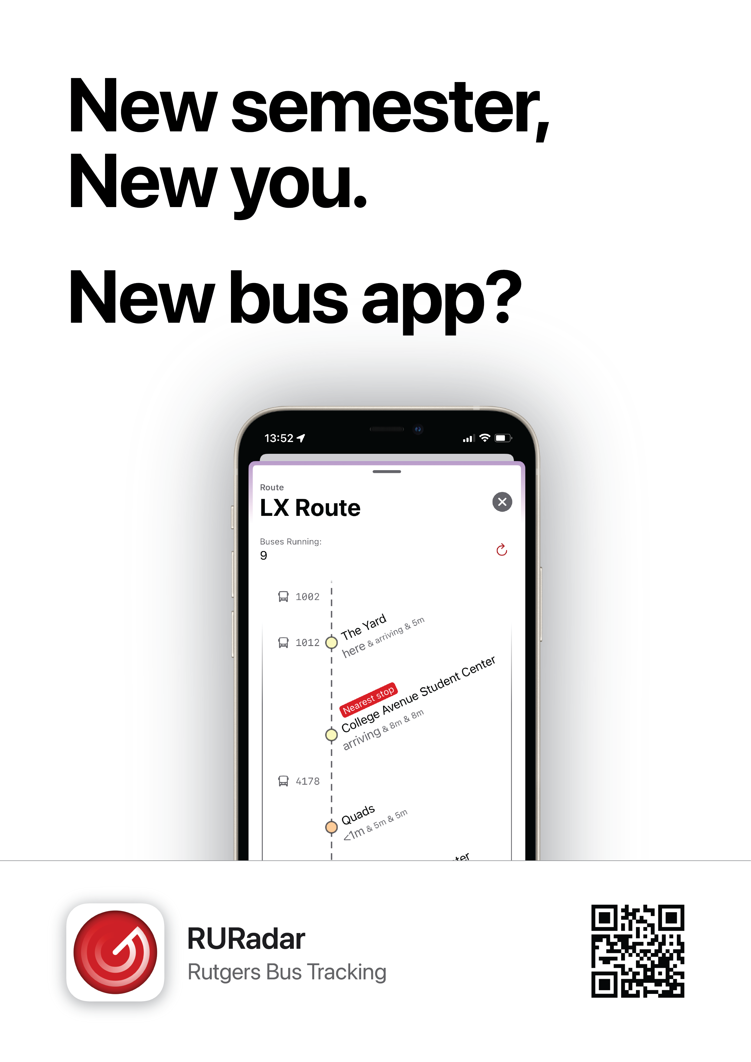
For some context, Rutgers buses didn’t run on a schedule, at least, not any schedule visible to students. The buses just ran in loops, in various different routes.
However, while Passio Go showed you a visual line of the route on the map, it couldn’t tell you the stops associated with a route, and most importantly, for Rutgers’s “Weekend Routes”, it didn’t tell you the order of the stops for a given route. Not being able to know which stops the bus will stop at, and how it gets there, was, in my opinion, a rather large “missing feature” of the app that made it essentially unusable for me.
I saw a student pull up a PDF on their phone just to reference the order of stops that the bus was going to take.
Clearly, the existing app was not enough for students to make it through a day on the Rutgers buses without digging through the University’s Infrastructure website.
The point of having a bus tracking app on your phone was to help you understand how to get places as fast as possible, and picking the wrong weekend bus meant waiting for at least another 20 minutes as the bus troddles through 2 other campuses before taking you home. Picking the right weekend bus could save you a lot of time, and there was no app on the market that solved this. Zooming into a PDF on your phone works, but I felt that the bar for making something better was ridiculously low.
So, I set off to make something I could use, something that solved my problems with Passio Go.
Working
Within a few weeks, I had figured out how to install Xcode, and follow along Apple's tutorials on how to make a basic app. With Apple’s (ridiculously barebones) documentation, and (made up by) the internet's breadth of Medium articles explaining how to do just about anything in Swift and SwiftUI, I put together a proof of concept.
No class was safe from me completely detaching myself to work on my app, and my roommate had to ask me more than once to turn off the laptop so he could get some sleep. I was tweaking and experimenting every chance I got.
Note that I never considered making it cross-platform. With how popular iPhones were at school, I felt no inclination to bother writing an Android app. It would have involved double the work in exchange for serving a small percentage of students, and managing the intricacies of both platforms on my own would have made both products worse off. Being a jack of all trades makes you a master of none.
From September 24th, 2023.
The P in prototype stands for “pretty”, obviously.
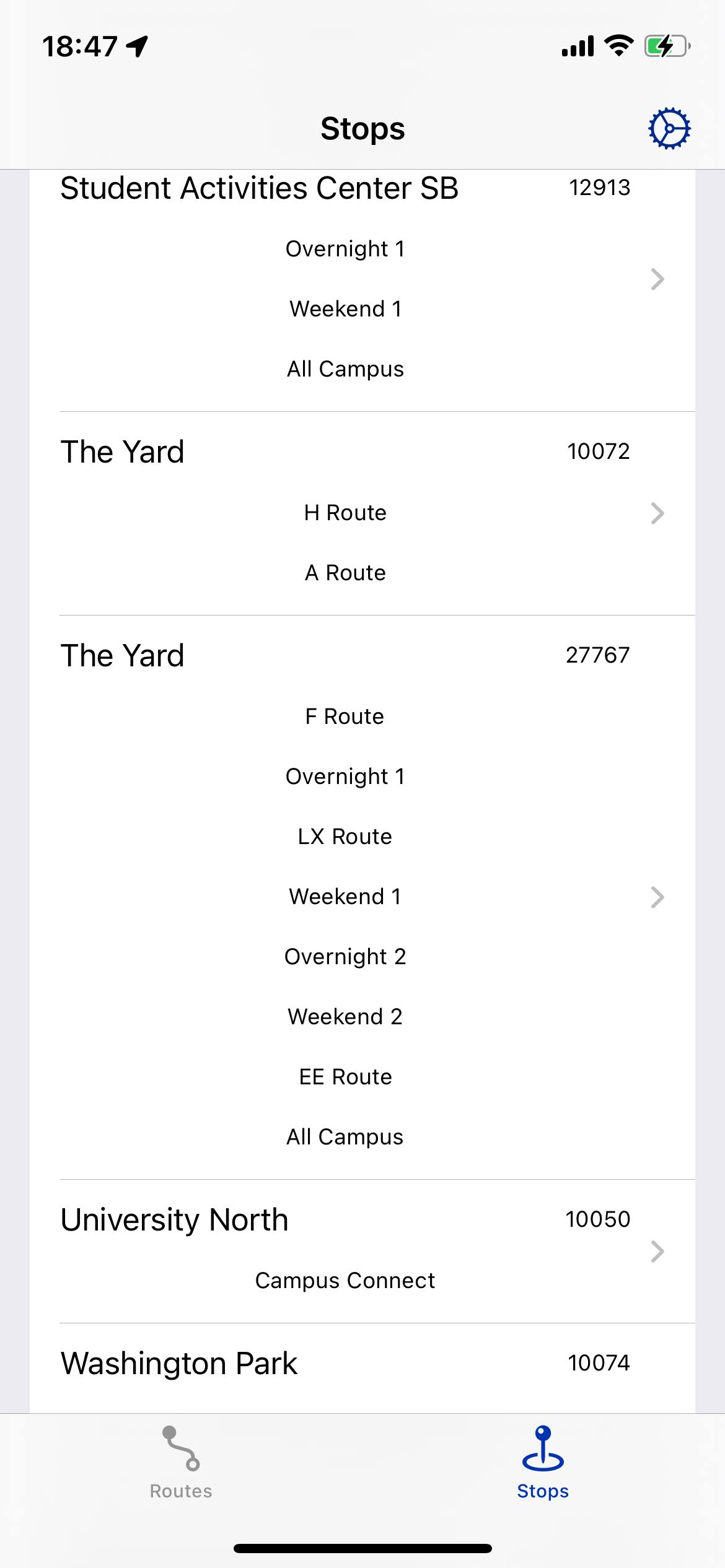
These were the stops, and I listed every route that served this stop, in service or not. To the right is the internal stop ID, which I was using to debug some stuff.
Enrolling as an Apple Developer…
Pro tip: Don’t try to sign up for the Apple Developer account using the app, whether it’s on the iPhone or Mac. The software is utterly incapable of capturing a photo of your ID, no matter what tricks you try. Save yourself the trouble, and sign up right on the website. They try to hide it from you, but under the banner that says “download the developer app”, there’s a little blue link that just asks you for your home address as “verification”.
Back to this infernal Apple Developer app:
The iPhone version forces you to use the wide angle lens on your phone, which is granier, and never seems to focus right. No, there is no way to switch it to the regular camera, or even the selfie camera.
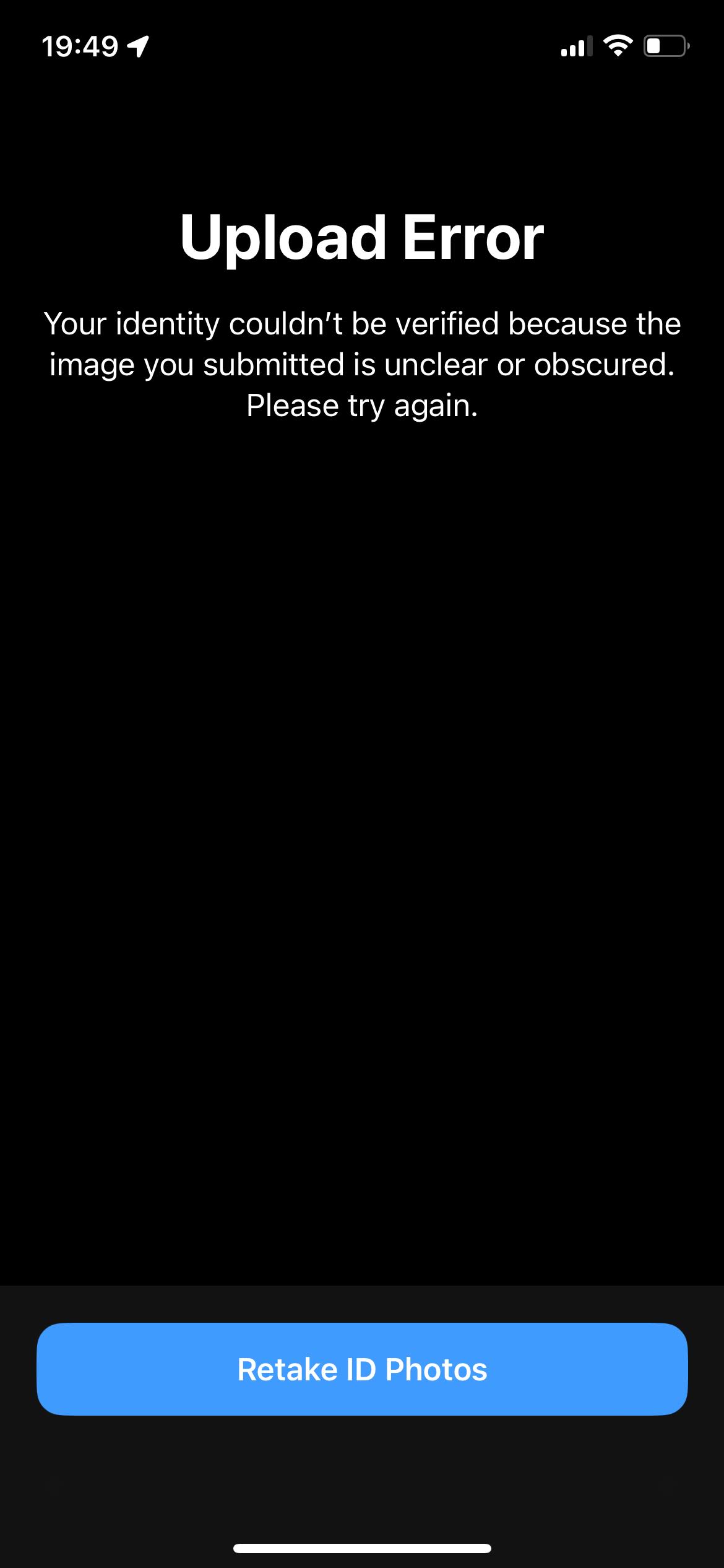
From November 10th, 2023. I was trying to get a proper Apple Developer account. The phone app was unable to read my ID, seemingly no matter what ID I tried, and it what conditions I took the photo.
On my Macbook Air M1, the camera is 720p and really grainy, because Apple didn’t think an old laptop body was worthy of a new sensor for the webcam. So, I tried using “Continuity Camera” to use my phone as a webcam, which worked great! The preview was crisp, in focus, and seemed more than sufficient to read my driver’s license, but there was a ridiculous bug in the Apple Developer app for the Mac. It would show you the feed with the card so you could line it up, but if it was using another camera, like your iPhone as a webcam, it would rotate your photo AFTER IT WAS TAKEN, which meant that it captured a completely irrelevant part of the image as the ID that it was going to try to read. Low and behold, OCR doesn’t perform well on a cinderblock wall, or whatever was in the background when I was trying to get this infernal system to read my ID. Trying to work around this bug, I was experimentally figuring out which part of the screen was cropped as “your ID”, but after 5 tries, Apple permamently blocked my Apple ID from signing up for an Apple Developer Account.
So, I made a new Apple ID, and searched online for how to fix this. Others had similar trouble with the app, vindicating my failure here.
It turns out that it was was simple, just sign up on the website, don’t use the app. I’d show you a tutorial for this process, but I can’t be bothered to sign up for yet another Apple ID.
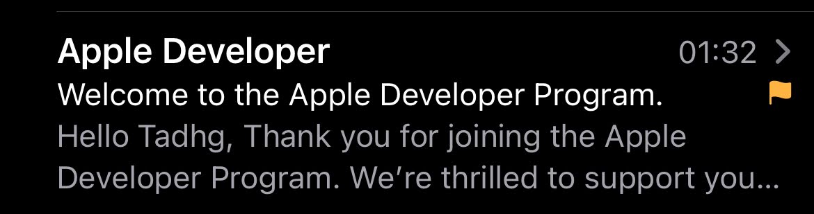
From November 16th, 2023. Finally, success.
Back to the app.
Also from November 16th, 2023. The “Stops” tab in an early version of RURadar, showing stops with their campus color, and a debug stop ID on the right.
With this fancy new Apple Developer account, I managed to get RURadar on Testflight, so my friends could actually test it out on their phones.
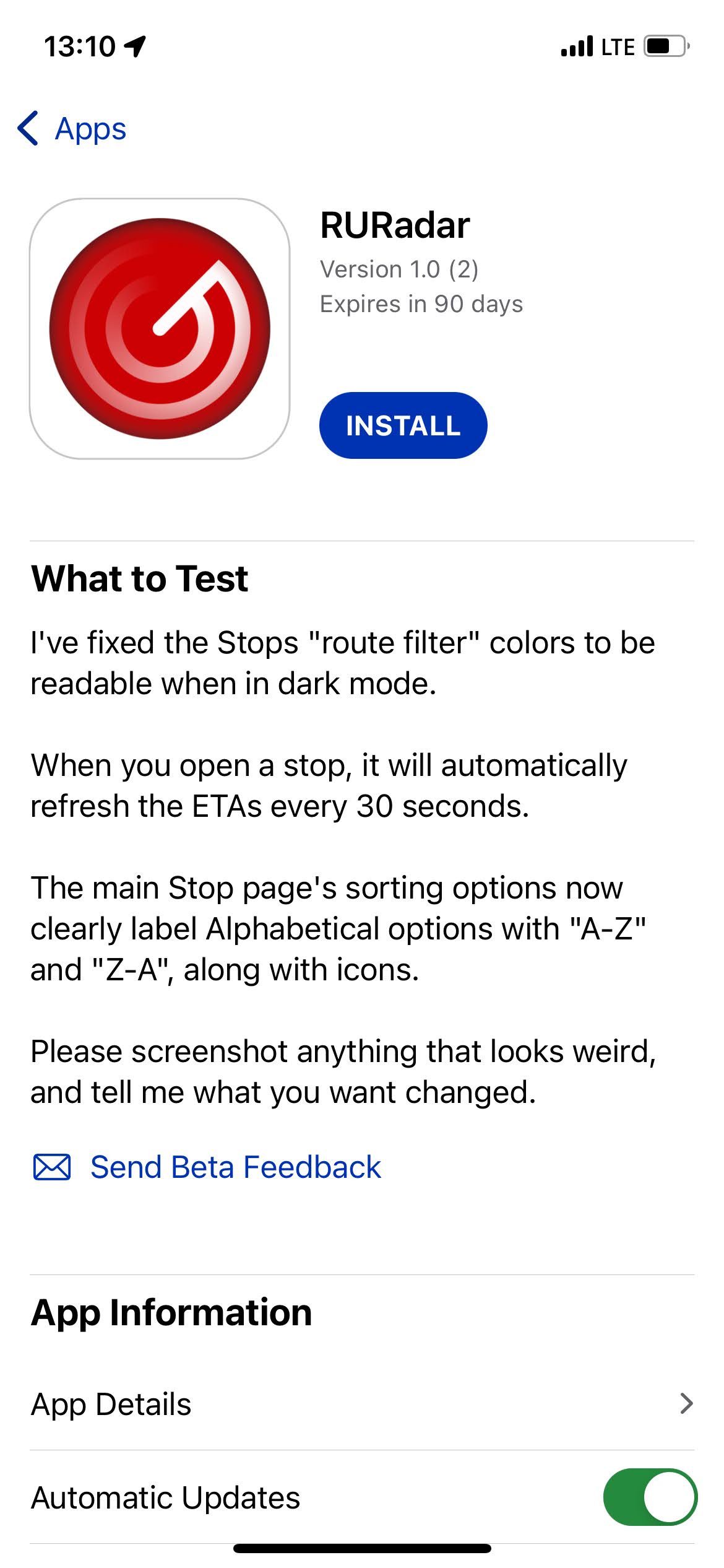
From November 17th, 2023. I wasted no time in getting RURadar in the hands of my close friends.
It wasn’t all perfect, but this is what TestFlight is all about.
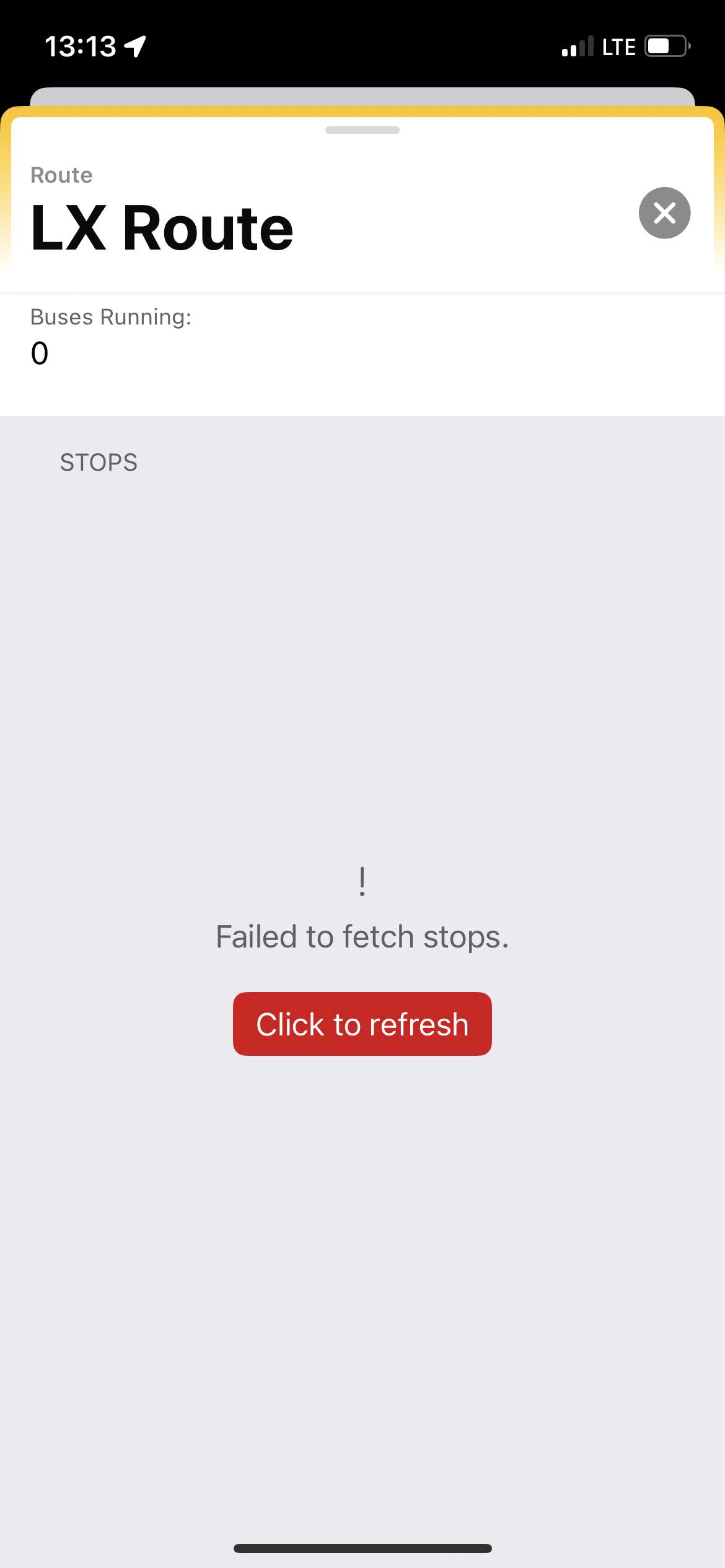
From November 17th, 2023. A screenshot of a route page in RURadar. There’s an error fetching the stops.
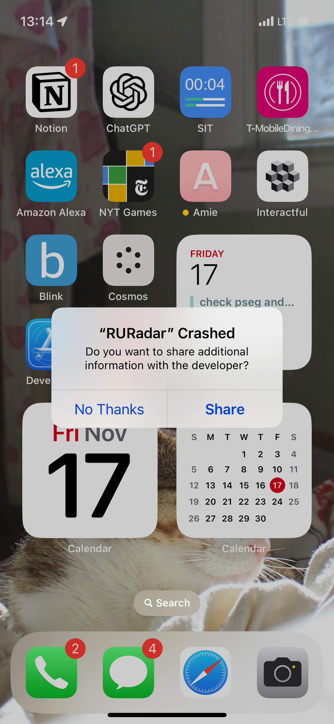
From November 17th, 2023. A screenshot of my app crashing to the home screen.
Specifying “to the home screen” is superfluous. All iOS apps crash to the home screen.
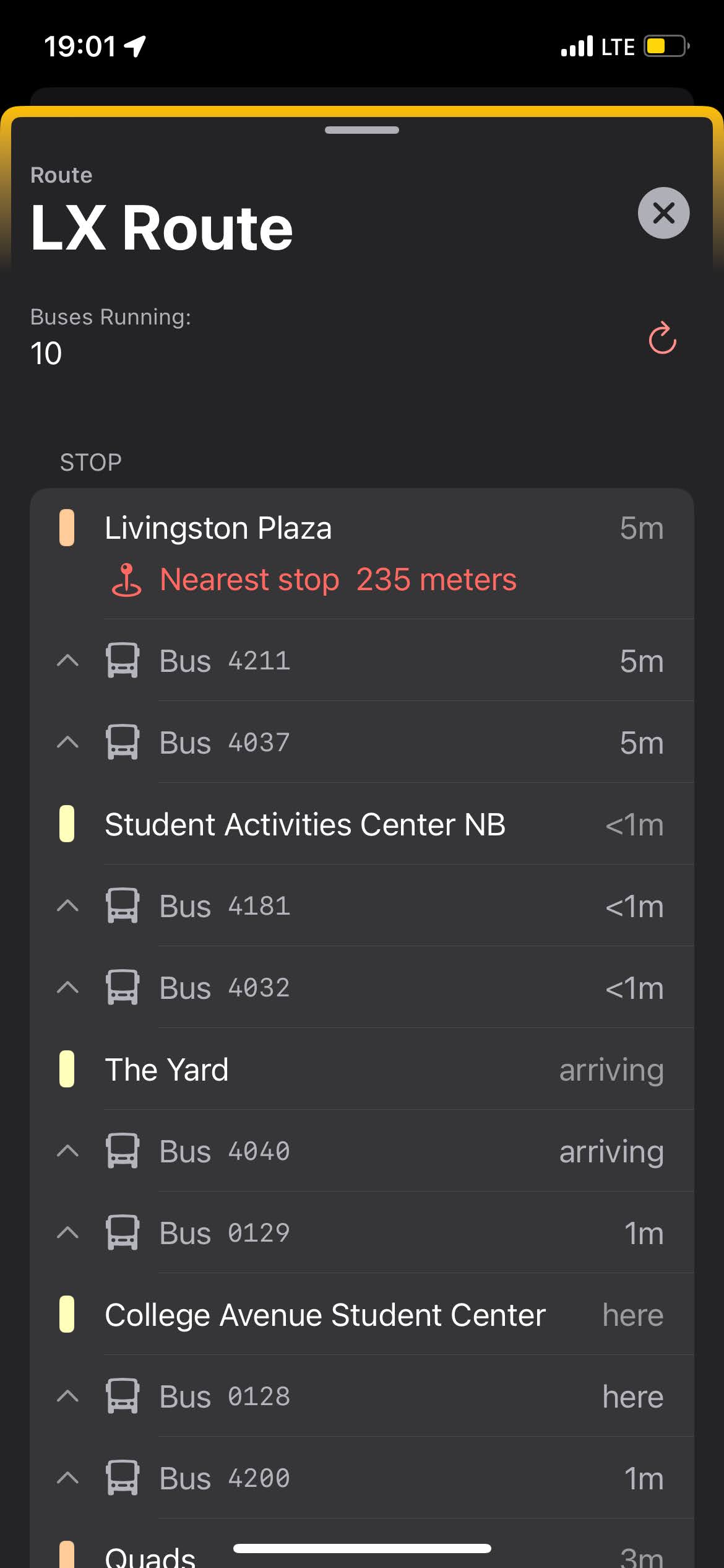
I remember a wonderful day, where I had gotten to the point where the app displayed a list of routes, and tapping on a route loaded the list of stops it would travel to, in order. Each route then displayed the ETA for the next arriving bus. This was a particularly noteworthy day because for the first time, I was using my own app on my phone to get somewhere. I was proud of myself.
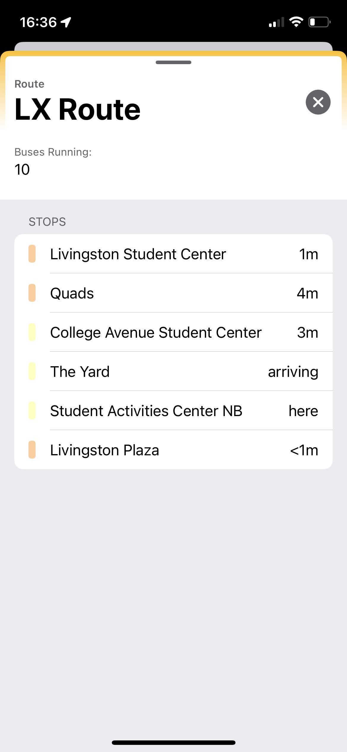
From November 20th, 2023. I’m not sure when exactly that wonderful day was, but it might have been sometime around here.
Innovations
I was in this wonderful mental zone where working on the app didn’t feel like “work”, because everything was new. The language was simply a curiosity to me, and I used it to do what I liked, largely irrespective of the “norms” for “how you’re supposed to do things in Swift”. Ignorance is bliss, and as long as it was reliable, I didn’t mind.
It’s very easy to get to a state of stuff that feels “hacky” with Swift’s handling of passing variables and information around. I had a race condition that caused a considerable amount of crashing on startup, but the probability of it happening was pretty low according to analytics. I eventually fixed one major cause of it, but I’m sure there’s something else that causes random crashes.
One fun thing that I implemented was a crude way to figure out which two stops a bus was “between”, using some logic surrounding the ETAs for each stop. For a given route, if you knew every stop’s list of shortly-incoming buses, you could keep a list of the ETAs for each bus, and when you found where it “wrapped around”, that is, the ETA went from the shortest ETA to the longest ETA, for example, “2 min” to “18 min”, you knew that the bus had just left the latter stop, and was on its way to arrive at the former stop. I just had to parse the ETAs to integers to do some comparisons. With this information, for a given route, I not only had the list of stops that the buses would travel to, but I also knew where to add “buses” to this list so that the buses were right underneath the stop they would arrive at next.
From November 27th, 2023.
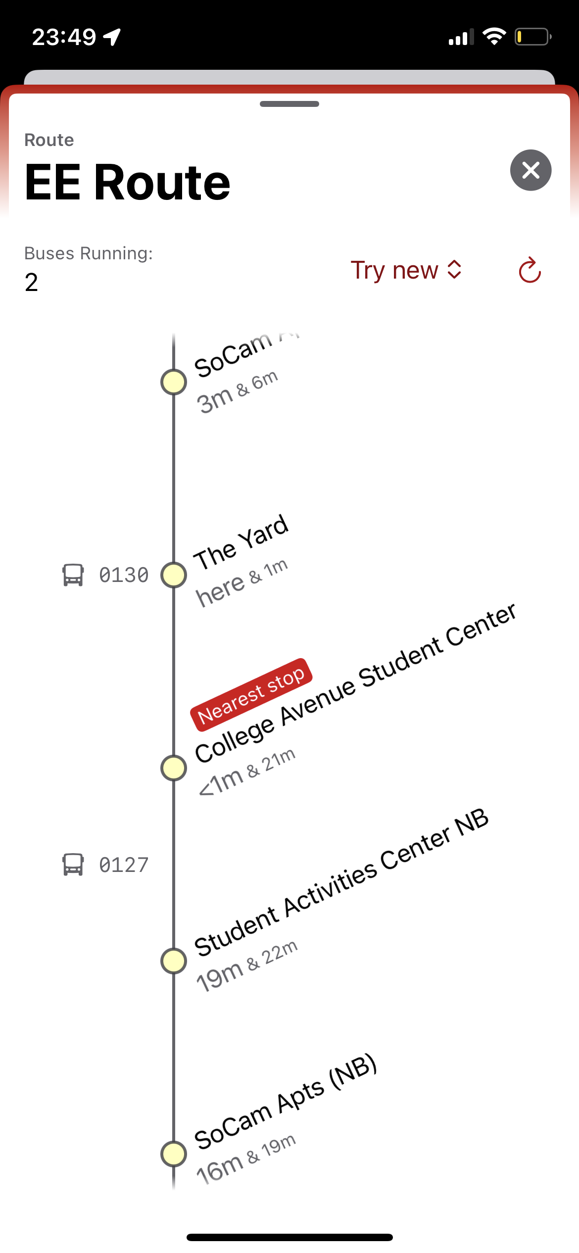
Another fun thing that I implemented was a clever little visualization of a route’s stops. Remember that I said that all Rutgers bus routes go in loops? Well, the list on the phone screen was simply a list of each stop. If a route had 6 stops, I listed 6 stops, and intertwined the incoming buses. However, this list didn’t make it clear that at the end of the list, it would wrap back around to the start of it. I wanted the list to wrap around indefinitely, just like the buses do. So, searching for “infinite scrolling library swiftui” was my path of action. However, everyone who makes an “infinite scrolling library” does it to load an infinite stream of content from the web, like Twitter or Instagram, but I needed something more like an “infinitely repeating list library”, of which, I eventually found one. So, the next iteration of this list of stops for a route mimicked how the buses behave on our campus: they just keep going around.
From December 7th, 2023.
Sharing
Throughout this process, I had my friends in the loop. My roommates, classmates, and previous year’s dorm-mates were my testers, and I leaned on them for a lot of feedback and guidance.
Being partially color blind, I relied on my roommate Andrew’s lack of color blindness (and enrollment in the Arts college) to verify that the colors I was choosing for various UI elements didn’t look hideous.
My friend Daniel was my dorm-mate last year, and was in a number of my classes sophomore year, and he was probably the biggest fan of RURadar. I remember distinctly that I had styled some buttons, and within seconds of getting the internal Testflight app loaded on his phone, he pointed out that I hardcoded them with a white / light-gray background, and it looked like shit, because I forgot about dark mode. It was still daytime, but he kept his phone in dark mode all the time. He paid attention to the details of the app as much as I did, and being a fresh set of eyes that were just as dedicated as my own, he definitely made my work better and found my mistakes quicker. Any time the app went down because of something I didn’t anticipate, I got a text from him.
Lastly, I was always striving to impress my friends with the software, which is hard, because all it does is display how annoying the Rutgers bus system can be at times. Putting makeup on a pig, as they say.
Needless to say, this work came from a good place and good motivation, which I think was crucial in making it a truly good app for the people in my community. Craft is the word that’s currently in vogue that describes the effort in the end result that I was going for, and how much I put in to this app’s overall user experience.
Publishing
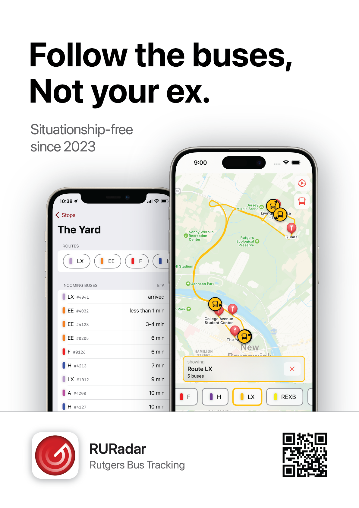
Now, this work was getting serious. The app was reasonably useful, and I wanted to help others rid themselves of Passio’s offering, like I was able to do. Unfortunately, that meant that I felt compelled to develop a “map” component of the app, because I figured that if you couldn’t look at a map, people would just say “well it doesn’t have a map so I can’t use it”.
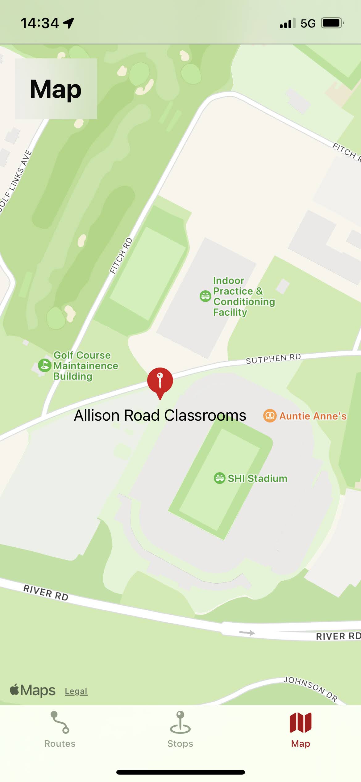
From November 28th, 2023. Baby steps.
An eagle-eyed reader might notice that the Alison Road Classrooms, or ARC, is not located next to the stadium. You’d be right. The code wasn’t creating new map pins, but it was assigning the name of the last stop in the list to the location of another stop in the list.
Unfortunately, Apple’s implementation of MapKit for SwiftUI is what one might call lackluster, and that’s being generous. Most of the examples that Apple demonstrates with SwiftUI’s MapKit would be adequately served by displaying a screenshot of Google Maps with your building of choice selected. You had “access” to Apple’s beautiful map engine, with its 3D buildings and nice color choices, but the ability to hook in and do about anything other than “display one pin on the map with a region pre-selected” was essentially nonexistent. It was getting better, but every small feature added to SwiftUI’s MapKit required that I drop support for iOS 15, which I was striving to maintain simply because one of my friends didn’t update her phone.
Thus, UIKit’s version of MapKit was all but required if I wanted any sort of interactivity with the map and maintain backwards compatibility. Having to work with UIKit right after learning SwiftUI as the way to make an iOS app was hard. I would have rather learned it the other way around. It which would have made me appreciate SwiftUI, instead of expecting its declarative beauty to exist everywhere.
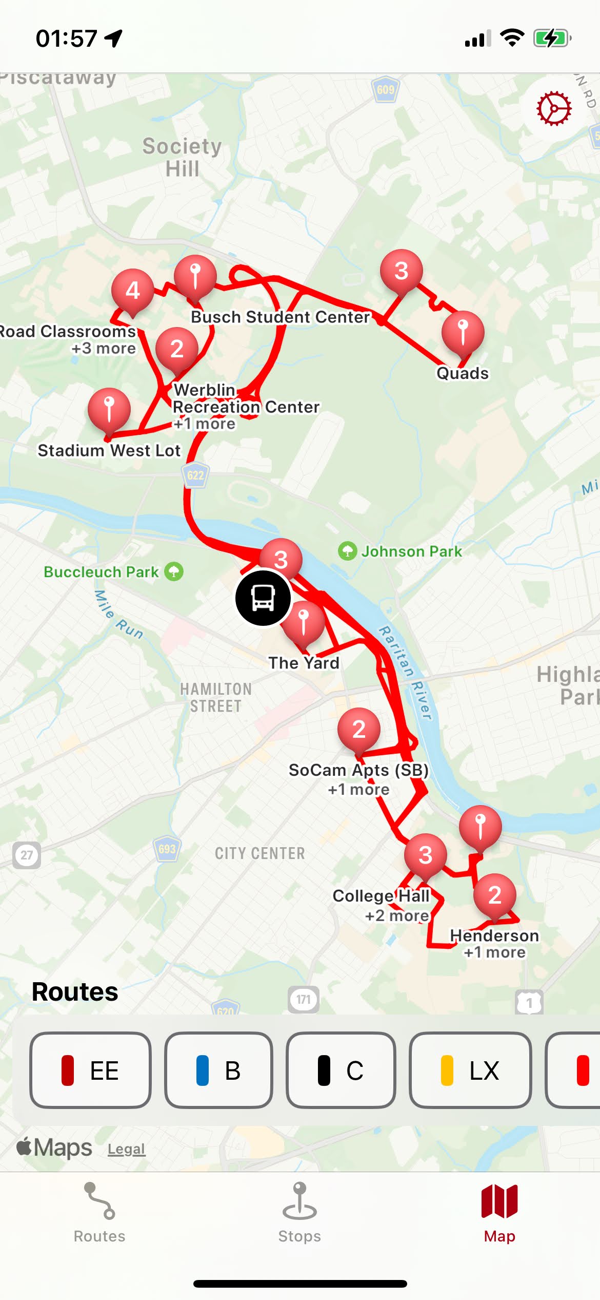
From December 31st, 2023, at 1:57 AM. Up late, apparently.
Regardless, the map came to be, and it wasn’t half-bad in its first iteration.
Release
Confident in my more well-rounded offering, I got it on the App Store in January. The approval process was new to me, and they told me to re-do my onboarding in terms of how I asked for location privileges. To be fair, my app was a textbook example of what Apple’s guidelines said not to do. I didn’t even look at Apple’s user interface guidelines because I figured they would have been as devoid of helpful tips as the Swift documentation was. I was wrong! They simply spent all their time writing the guidelines, correctly assuming that the work of figuring out their OS’s frameworks was easier to let the internet research on its own.
From January 4th, 2024. I was really, really proud to see this.
It was released right as the winter semester started, which meant that it wasn’t going to be a blockbuster hit in terms of download figures. College students are open to just about anything when Fall semester starts, but as the school year progresses, people find their group of friends, they practice their routine, and they don’t bother trying new things past November, really.
But, I didn’t care. I wasn’t making money off of this, I was happy with anything. When 1,000 people had downloaded my app, I was beyond happy. The point was to be an improvement on what students were stuck with, and to be the app that a discerning student would choose because it was better, and they understood that it was better, both in a cosmetic way, and in a functional way.
Visual Language
Identity
RURadar was unapologetically an app that deferred much of it’s style to the Apple ecosystem, from the identity, UX, to most of the interface, frankly. Instead of standing out, I would have rather made RURadar feel like it was bundled with the operating system, something that just felt right on an iPhone.
All good apps have an iconic, well, icon. The app’s name of “radar” gave me a good hint of where to start, and I put the elements together. Rutgers red - well, not their exact red, because that’d be a legal issue, and a radar-esque scanning glyph.
I don’t know why I made the glyph spin counter-clockwise. It seems odd now, as every reference image of a radar image shows them spinning clockwise.
Fun fact; tap the “RURadar” logo in the settings of RURadar, and it spins! (The one on this website does not.)
Branding
I wanted RURadar to be invisible. Good software gets out of the way, and RURadar didn’t need to have a personality. Maybe what I wanted the app to say was that “I care about what tools I use to go about my day. It’s not worth my time to wrestle with an unintuitive system.” What I knew for sure was that if I was going to attach any sort of personality to this app’s brand, it would be a snarky one. Dbrand does a great job with this, and I was inspired.
I was inclined to put up advertisements around campus for my app, but I ended up not posting anything up because I felt that I didn’t need to. I read somewhere that “Advertising is just making up for a boring product”, and it felt like I could prove the point that my app was so good that people would simply tell others to download it, because it was just that much better than what they were currently using.
This quote, that ads “make up for boring products”, does not hold universally. It is often harder and slower to spread “naturally”, or by word of mouth. However, on a college campus? That’s how everything of value spreads. That, and on our subreddit, I suppose.
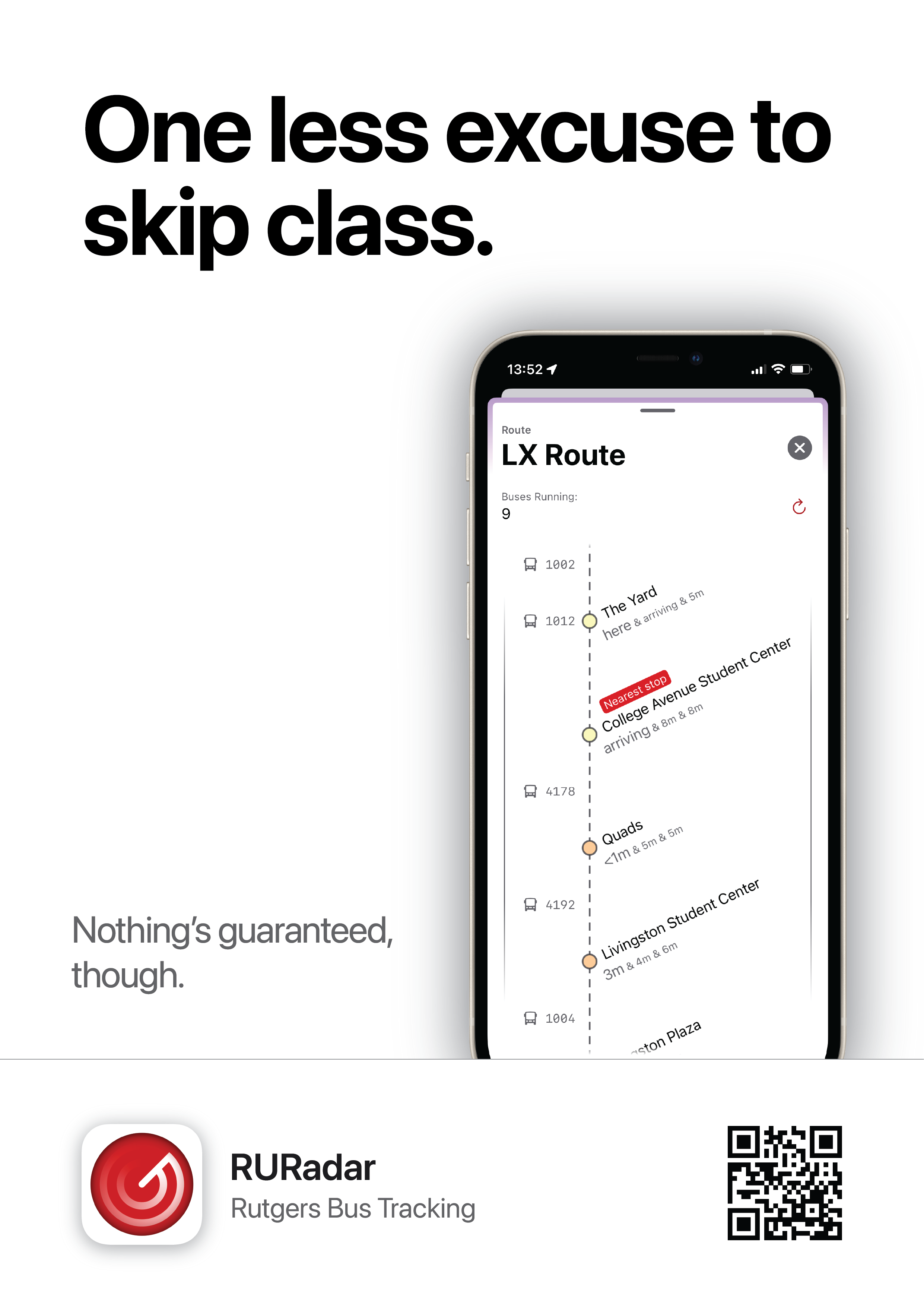
Even though I thought I was above the “call this number for tutoring” printouts on every window on campus, I still drafted up advertisements for my app, because I wanted to.
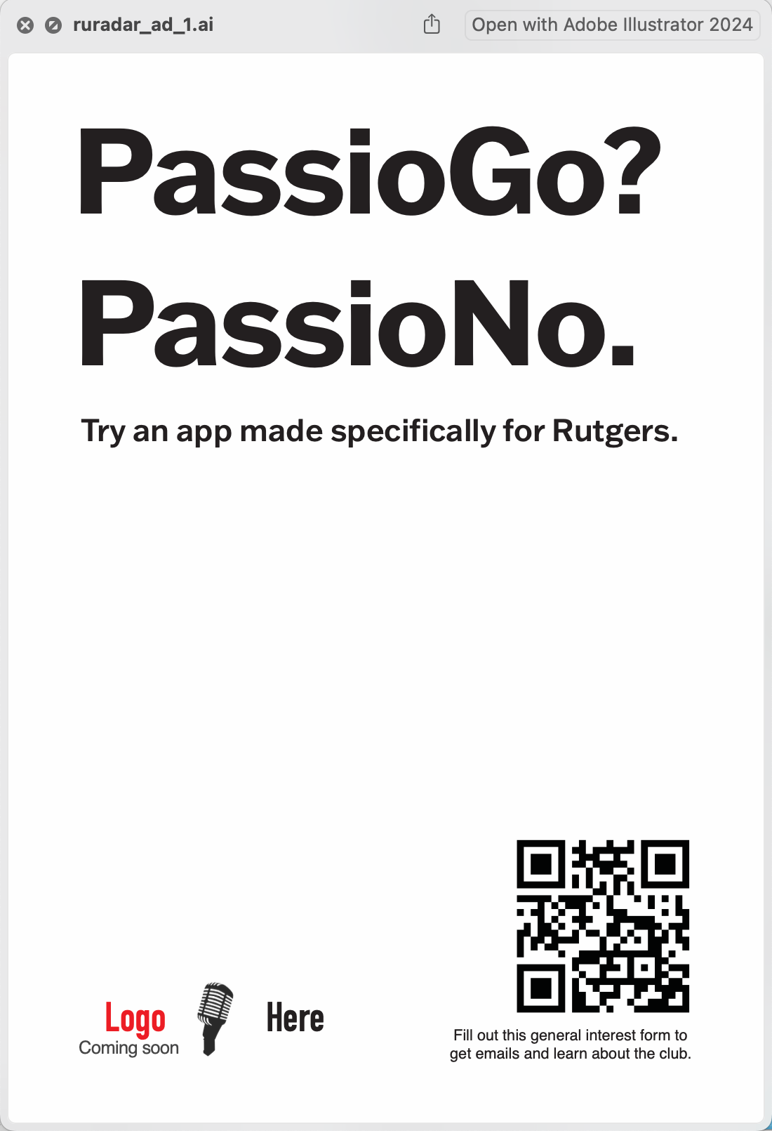
From November 27th, 2023. This was a rejected idea. Using Passio Go’s name seemed like a cheap attack, and this message really didn’t explain what the poster was about, anyhow. As much as I didn’t like it’s UI, this wasn’t the way to claim that my system was “better”.
Also from November 27th, 2023. Another rejected draft.
You’ll notice that there’s “Logo Here” on the bottom left. I was using templates from my work on the Karaoke Club’s posters.
You’ll also notice that these adverts might slightly resemble old Porsche advertisements. That’s intentional. Big text, hero image. Maybe a small punchline as well.
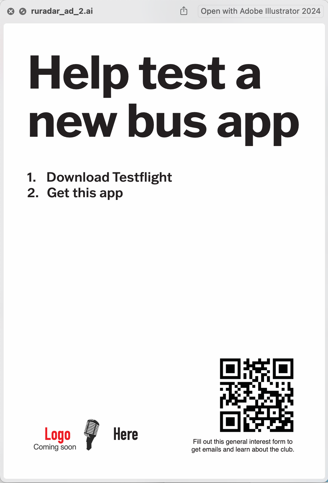
From January 17th, 2024. Now, we’re getting somewhere. For context, the spring semester had just started, and I was going for a “you can rebrand yourself, it’s not too late!” kind of message. As if a bus tracking app could change you.
I switched to Apple’s font. Again, the identity bowed to the ecosystem I designed it for. Not a lot of individuality displayed, but that’s ok.
Also from January 17th, 2024. This one sort-of missed the mark. The joke was alright, but the poster was too indirect in implying that “this bus app makes riding the buses easier”. Balancing the amount of context between “Huh? I don’t understand.” and “It’s so written out that it’s not funny anymore” is not easy.
Also from January 17th, 2024. I was on a roll on that day. I think this one is cute. However, I think it still doesn’t work as well as I wanted it to. I believe the advert that I was trying to copy was the famous “Got Milk?” ad.
You can make something trendy, or you can make something timeless. This certainly isn’t timeless. At some point in time, it did follow some trends, but now, it just seems off. However, I really don’t think this was a bad ad, overall.
Of course, I never put any of these up on campus. I did, however, hang two in my bedroom.
I still felt that I was above putting up ads. As much as I would have liked to give more students a chance to more easily understand the bus system, I liked the idea of my app spreading by its reputation better than a handful of 8.5x11 inkjet printouts. I didn’t want to be just another poster on the wall.
I also had the advantage of not needing to worry about how many people downloaded it. It didn’t cost me anything to run, I had free time to develop and maintain the app, and the way the app paid me was in the knowledge that I was singlehandedly making a small part of college life a little easier to navigate. These are not common circumstances, and the “real world” demands return on investment, but in many ways, and for some people, college life in America isn’t the “real world”, and sometimes, it’s not supposed to be.
Interviews!
On February 27th, 2024, Uriel Issacs from The Daily Targum reached out to me asking for an interview about RURadar. I gladly accepted, as it’s a topic I can drone on and on about. He interviewed me on March 5th, and the article came out on the next day. Fast reporting. You can read it here.
On March 25th, 2024, Francine Tardo from 1776, the Rutgers Alumni Association reached out to me as well, referencing the Targum article, and asked if I’d like to be in the Alumni’s magazine! Of course, I said yes. I answered her questions, and in December, I was able to see the final product. She even offered to send a physical copy of the magazine, which has probably been the best piece of mail I’ve received in the last few years. It was such a wonderful touch. You can read the article here , but I don’t know where you can get a physical copy.
Wrapping up
That concludes just about everything that I could think of regarding my first app. I feel very lucky for all the circumstances that lined up that helped me get this done - from the university’s switch to Passio Go, Apple’s easy to learn language and UI framework, and the free to use Passio Go API that made it even technically feasible. It also helped that I didn’t have any substantial competition, as everything else comparable was a web app.
Everyone who programs has the opportunity to become the glue that connects people to new information, and I felt that I did a good service, helping Rutgers students view the bus information with a helpful little app made just for them, by one of them.
Extra: Testimonials!
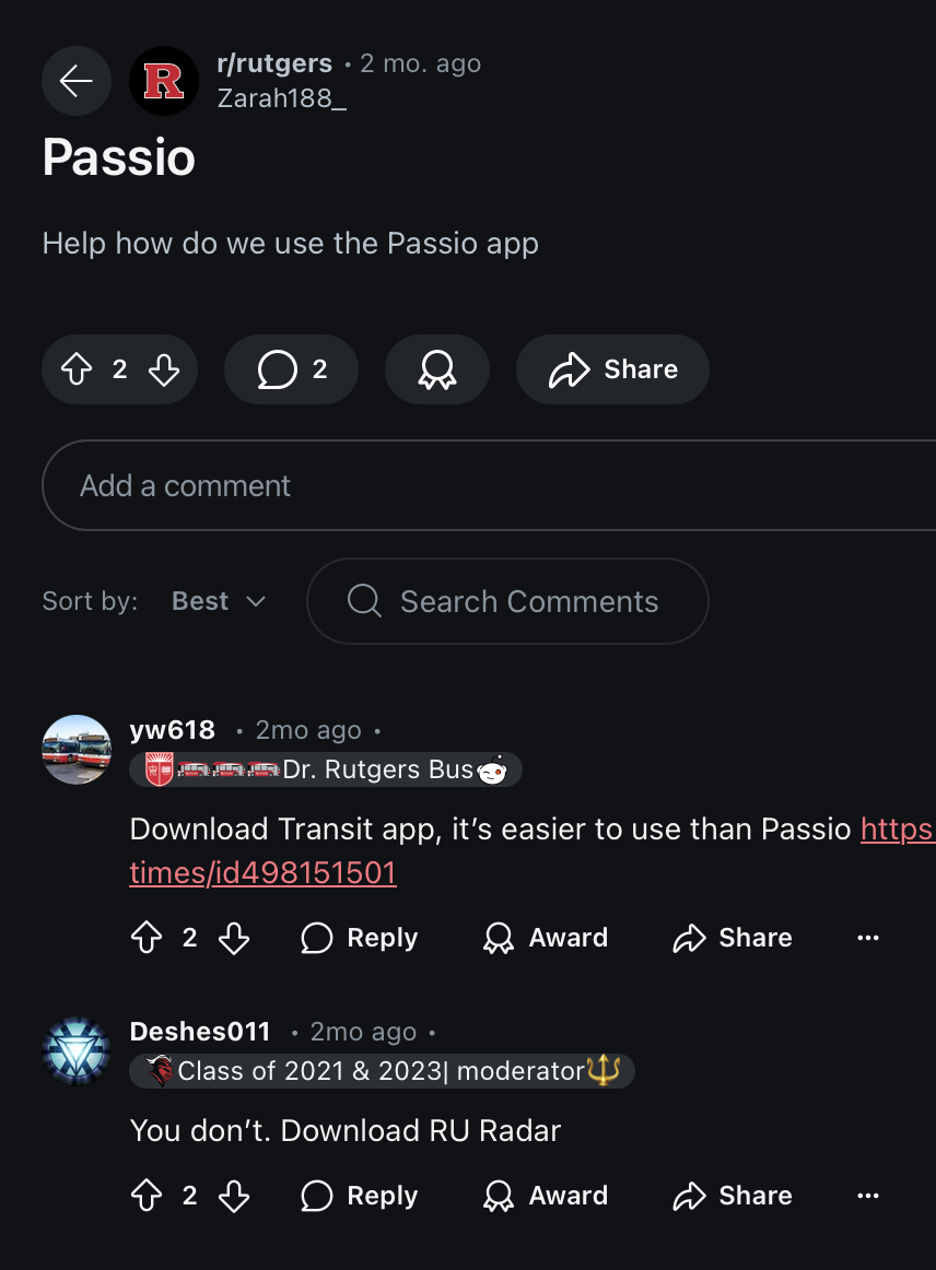
These are screenshots I pulled from Rutgers's subreddit.
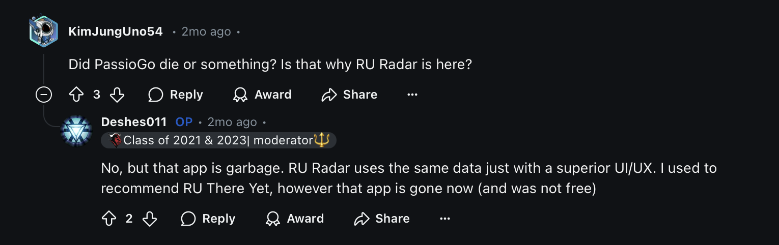
Superior!
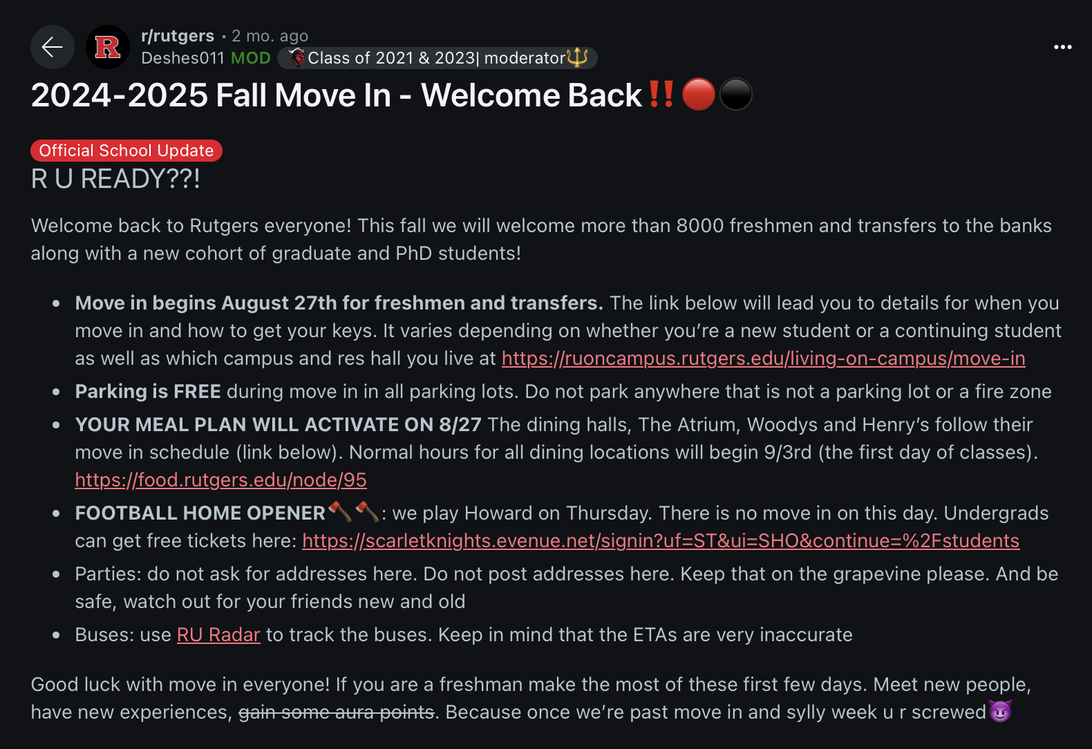
Included on the “move in” guide threads!
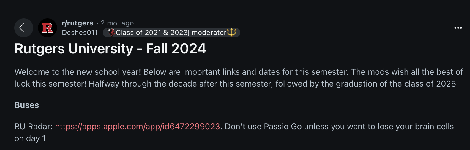
Recommended for visiting alumni as “the bus app”
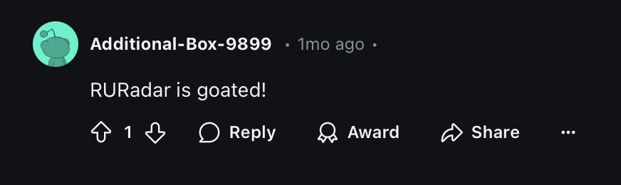
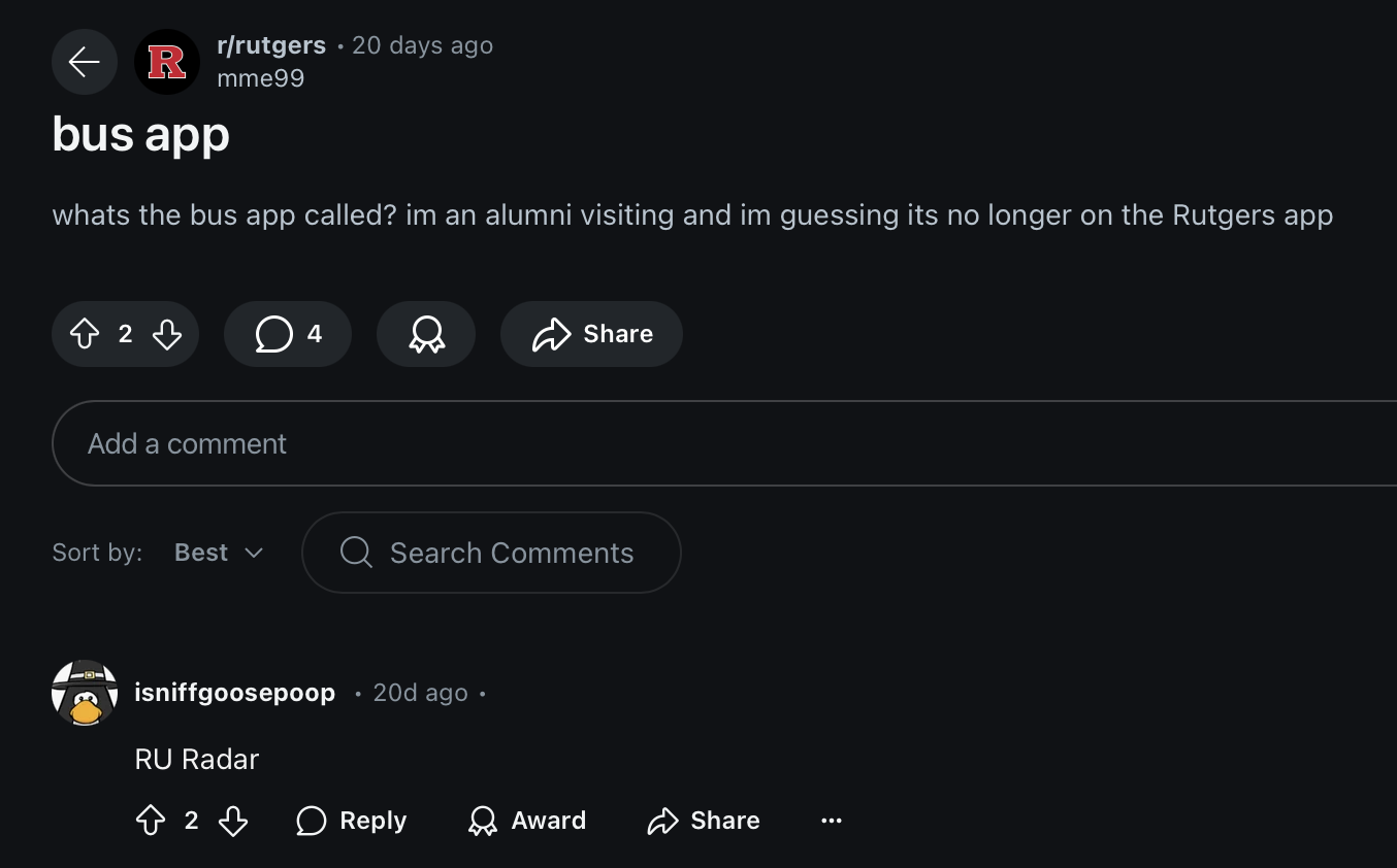
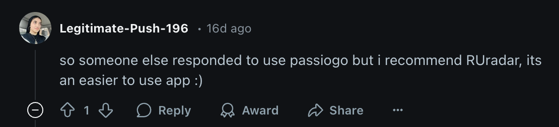
Goated
Transit is a very good app, but I have the advantage of specializing for Rutgers, where Transit covers most of the US!
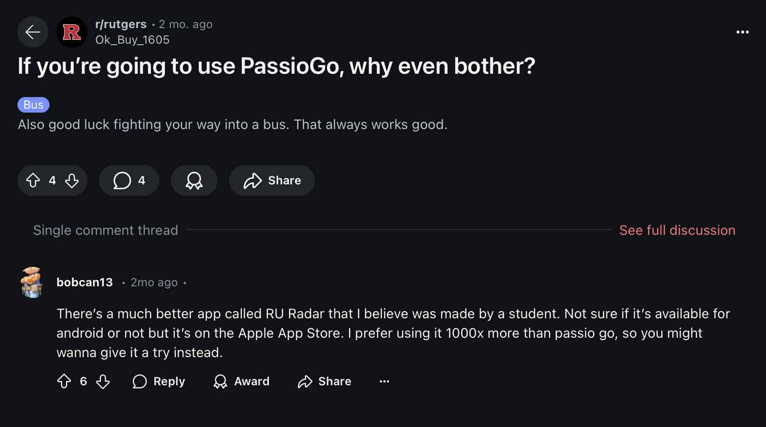
“prefer using it 1000x more”. My work here is done. The people finally care about UX!
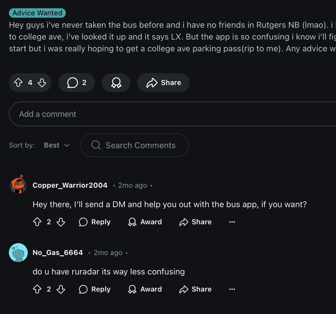
“less confusing” is actually, exactly what I was going for.
“easier to use”! Yes!
These comments are what you should develop for. It’s what I do it for.